
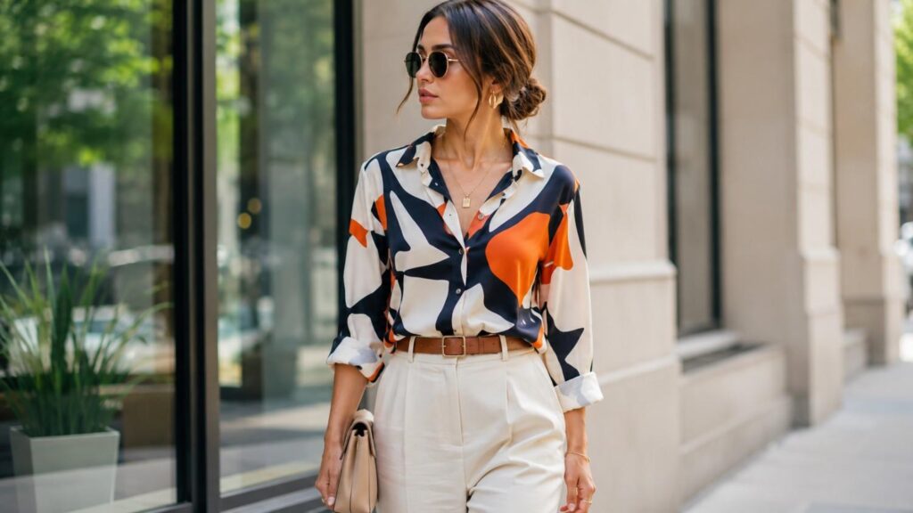
How to Wear Bold Prints Without Overdoing It
Bold prints can transform a simple outfit almost instantly. Florals, leopard spots, stripes, abstract motifs, polka dots, checks, and geometric patterns add personality without requiring complicated styling. They can make a basic silhouette feel expressive, turn a familiar wardrobe piece into a statement, and help you create outfits that look more intentional. The difficulty comes when several strong elements compete for attention at the same time.
That is why learning how to wear bold prints without overdoing it is less about memorizing strict fashion rules and more about understanding visual balance. A successful printed outfit usually has a clear hierarchy. One garment leads, while the other colors, accessories, fabrics, and silhouettes support it. When everything fights to become the focal point, the outfit can appear busy. When the elements relate to one another, the same level of color and pattern can look sophisticated.
Beginners often assume bold patterns only work with black, white, or other quiet basics. Those combinations are useful, but they are not the only solution. Once you understand color harmony, pattern scale, proportion, and repetition, you can combine bold prints with stronger colors and even additional patterns.
The sections below explain how to style bold prints for casual outfits, workwear, evenings, printed dresses, animal prints, mixed patterns, and more. The aim is to help you build outfits that feel expressive without losing clarity.
Why Do Some Bold Print Outfits Look Balanced Instead of Busy?
A bold outfit can contain plenty of color, movement, and contrast while still looking polished. The difference usually comes down to visual organization. Balanced outfits guide the eye rather than forcing it to process several equally strong elements at once. When one print is clearly dominant and the supporting pieces share related colors, textures, or proportions, the overall appearance feels intentional.
Busy outfits often lack that hierarchy. A large floral print may compete with highly decorated shoes, oversized jewelry, a contrasting handbag, and another equally strong pattern. None of those choices are automatically wrong, but when every item demands attention, the outfit can lose focus. Strong personal style is not necessarily about wearing fewer interesting pieces. It is about deciding how those pieces interact.
A practical approach to mixing prints with solids is to let one patterned piece lead while using simpler colors and textures around it.
One thing I recommend checking first is the outfit from a distance. Instead of examining each garment individually, look at the complete silhouette. Ask yourself what you notice first, what you notice second, and whether anything feels disconnected. This simple habit helps identify whether a print is being supported or overwhelmed.
Color repetition is another important tool. When a shade from the main print appears elsewhere in the outfit, the eye recognizes a relationship between the pieces. The combination feels connected even if the garments are very different. With practice, these principles make bold patterns much easier to control without making them feel dull.
Give the Outfit One Clear Focal Point
A focal point gives an outfit direction. If you are wearing wide-leg floral trousers, those trousers can serve as the main visual feature. A solid knit, understated footwear, and simple handbag then create a frame around them. This does not mean every supporting piece must be boring. It means the secondary pieces should not compete with the trousers at exactly the same level.
The same method works with a patterned blazer. Wear it over a solid dress, neutral trousers, or a simple shirt before experimenting with extra statement pieces. Once the blazer clearly leads the outfit, you can decide whether a stronger shoe, bag, or jewelry choice adds value.
A focal point becomes especially important when the print is large, high-contrast, or highly colorful. Strong patterns naturally attract attention. Giving them enough breathing room allows the design to look sophisticated rather than crowded.
For advanced styling, you can create a secondary focal point, but it should still remain visually weaker than the first. This creates interest without destroying hierarchy.
Use Color to Connect the Outfit
Color is one of the easiest ways to make bold prints feel coordinated. Start by examining the pattern carefully and identifying its dominant and secondary shades. You do not need to match every color. Instead, choose one shade from the print and repeat it through another garment or accessory. This repetition creates a visual link that makes the outfit feel planned.
Imagine a skirt with cream, forest green, burgundy, and soft pink florals. A cream blouse creates a calm combination, while a burgundy handbag adds stronger coordination. A green blazer could create an even more expressive look because it repeats one of the major colors in the pattern without introducing an unrelated shade.
You can also use broader color relationships. Analogous colors sit near one another on the color wheel and often create softer harmony. Complementary colors sit opposite each other and create stronger contrast. Neither approach is automatically better. The right choice depends on whether you want the final outfit to appear calm, energetic, elegant, or playful.
Using color deliberately allows you to wear more than simple neutrals without making the outfit feel random.
How to Wear Bold Prints Without Overdoing It Step by Step
Styling bold patterns becomes much easier when you build the outfit in stages. Instead of choosing several dramatic pieces at once, start with one garment and let each additional item respond to it. This approach helps you see where balance is working and where visual competition begins.
The first step is deciding which printed piece will lead the outfit. It might be a floral dress, striped trousers, animal-print jacket, geometric blouse, patterned skirt, or even printed footwear. Once you choose the main item, consider the colors already present in it. Those colors can guide the rest of your choices.
Next, build a quieter base. Solid garments are useful because they create contrast without adding another pattern. That does not mean you must choose black or white. A solid shade pulled directly from the print can look more sophisticated and intentional.
For an easy starting point, styling bold prints around one standout piece and neutral basics can keep the outfit expressive without making it feel overloaded.
After the clothing is complete, evaluate the accessories. Many outfits become overloaded because the bag, jewelry, shoes, belt, and sunglasses are all added independently. Accessories should support the final look rather than simply occupy space.
This step-by-step method works for beginners because it reduces guesswork, but it is also useful for experienced dressers. Advanced styling still depends on editing. Even highly expressive outfits benefit from knowing which details contribute to the overall concept and which ones simply create noise.
Step 1: Start With One Statement Piece
Begin by identifying the garment that deserves the most attention. This becomes the visual anchor for everything that follows. A printed dress is an obvious statement piece because it covers a large area of the body. However, trousers, jackets, skirts, shirts, shoes, scarves, and bags can perform the same role depending on their color, size, and pattern.
If you are new to bold patterns, start with a piece you already feel comfortable wearing. Printed trousers with a familiar T-shirt may feel more approachable than a full patterned suit. A leopard-print bag or striped shoe can also introduce pattern gradually without changing the entire outfit.
Pay attention to the scale of the print. Large florals, wide stripes, oversized geometric shapes, and high-contrast patterns naturally appear more dominant than small dots or subtle motifs. The stronger the pattern, the more useful it becomes to simplify the pieces around it.
Starting with one clear statement item also prevents impulse styling. Instead of adding pieces because each looks interesting individually, you begin choosing them according to how well they support the main design.
Step 2: Build a Quieter Base
Once you have selected the statement piece, create a foundation around it. Solid clothing is usually the easiest starting point because it allows the pattern to remain visually dominant. A patterned blouse can work with plain trousers, while a printed skirt can be paired with a solid knit or simple shirt.
The color of the supporting garment matters just as much as whether it is patterned. Neutrals create the greatest contrast and are useful when you want the print to stand out. However, repeating one of the shades already present inside the pattern can create a richer and more coordinated result.
| Statement Print | Easy Supporting Piece | Stronger Alternative | Accessories |
|---|---|---|---|
| Floral skirt | White or cream top | Top matching one floral color | Simple bag |
| Leopard jacket | Black or denim base | Burgundy or red accent | Minimal jewelry |
| Printed dress | Neutral shoes | Coordinating color shoes | Structured handbag |
| Geometric shirt | Solid trousers | Tonal trousers | Plain belt |
| Striped trousers | Solid knit or tee | Contrasting solid color | Simple footwear |
The purpose of the base is not to make the outfit plain. It is to create enough structure for the print to look intentional.
Step 3: Add Accessories Last
Accessories are often where a well-balanced printed outfit becomes unnecessarily crowded. For that reason, add them only after the clothing combination is already working. Step back, look at the full outfit, and ask whether it feels complete before introducing jewelry, a bag, belt, scarf, sunglasses, or statement footwear.
If your printed garment already contains several colors and a complex pattern, simple accessories may provide the best finish. A structured handbag, understated earrings, and clean footwear can reinforce a polished look without introducing another focal point.
However, simple does not always mean neutral. A bright bag can work beautifully if it repeats a shade already present in the pattern. Metallic jewelry can also add contrast without creating another competing print.
The most useful rule is to make accessories respond to the outfit rather than choosing them automatically. If an accessory does not improve balance, color continuity, proportion, or function, it may not be necessary.
Adding accessories last helps you edit more effectively and prevents a strong patterned outfit from becoming visually overloaded by details that were never needed.
How Should You Style Different Types of Bold Prints?
Different prints create different visual effects, so a single styling formula will not work equally well for every pattern. Large florals can feel romantic or dramatic, geometric prints often look graphic and structured, stripes create directional movement, and animal prints can function almost like textured neutrals depending on their color palette.
Before styling any bold pattern, consider three things: scale, contrast, and color density. A large black-and-white geometric pattern has high contrast even though it contains only two colors. A floral print may contain five or six shades but still feel softer because the colors blend more gently. Understanding that difference helps you decide how much additional color or pattern the outfit can handle.
Fabric and garment shape matter as well. The same floral design will look different on a flowing maxi dress than on a sharply tailored blazer. A soft silhouette creates movement, while structured tailoring can make the pattern feel more graphic and deliberate.
Rather than treating all prints as difficult, learn the personality of the pattern you are wearing. Ask whether it already feels busy, whether it has an obvious dominant color, and whether the shape of the garment makes it casual or formal.
Once those questions are answered, styling becomes more intuitive. You can decide whether to use neutrals, tonal colors, contrasting shades, structured accessories, or additional patterns based on what the garment actually needs.
Bold Print Types and Styling Approach
| Print Type | Visual Character | Best Supporting Pieces | Styling Direction | Ideal Balance |
|---|---|---|---|---|
| Floral Prints | Romantic, colorful, expressive | Cream, white, denim, or solid-color basics | Let the floral pattern remain the main focal point | One bold floral + simple supporting pieces |
| Geometric Prints | Structured, graphic, modern | Solid trousers, plain tops, minimal accessories | Keep the silhouette clean to complement strong lines | Strong pattern + uncomplicated shapes |
| Leopard Print | Bold, versatile, high-contrast | Black, denim, cream, brown, or chocolate tones | Use everyday wardrobe basics to make the print more approachable | Animal print + familiar wardrobe staples |
| Zebra Print | Graphic, monochromatic, dramatic | Black, white, denim, or one controlled accent color | Keep additional patterns limited | Zebra print + restrained color palette |
| Stripes | Classic, directional, structured | Solid knits, denim, trousers, or skirts | Use stripe width and direction to influence the overall effect | Stripes + one dominant supporting color |
| Polka Dots | Playful, retro, visually repetitive | Solid-color layers and understated accessories | Allow the repeated dot pattern to provide most of the visual interest | Polka dots + minimal competing details |
| Printed Dresses | Complete statement outfit | Neutral shoes, structured handbag, simple jewelry | Treat the dress as the primary focal point | Printed dress + understated accessories |
| Printed Co-Ords | Coordinated, polished, intentional | Neutral shoes, simple bags, solid outer layers | Use the repeated print to create cohesion | Matching print + controlled accessories |
Florals and Geometric Prints
Floral prints range from delicate scattered flowers to oversized botanical designs. Because large florals already create plenty of movement, they often work best when the surrounding garments are relatively simple. Instead of trying to match every flower or leaf, select one shade from the print and repeat it elsewhere. This approach creates cohesion without making the outfit look overly coordinated.
Small florals are easier to layer because they usually create less visual weight. They can work with denim, knitwear, tailoring, or even another subtle pattern if the colors connect.
Geometric prints behave differently. Strong lines, repeated shapes, grids, and abstract blocks create a more structured visual effect. When a geometric pattern is high contrast, clean silhouettes help prevent the outfit from becoming overly complicated. Straight-leg trousers, a simple blazer, or minimal footwear often work well because their shapes do not compete with the graphics.
Both florals and geometric prints can become statement pieces. The difference lies in mood. Florals often feel softer and more organic, while geometric prints can look architectural, modern, or energetic depending on scale and contrast.
Animal Prints and Stripes
Animal prints such as leopard, zebra, snake, and tiger can be easier to style than they first appear. Many traditional animal-print color palettes contain black, cream, beige, brown, or tan, which allows them to work with familiar wardrobe basics. Leopard in particular can function almost like a textured neutral when paired with black, denim, camel, chocolate brown, or cream.
If you want beginner-friendly animal print outfit ideas, start with one printed item. A leopard skirt with a black knit or a zebra blouse with solid trousers creates strong visual interest without requiring complicated styling.
Stripes are equally versatile but behave differently because they create clear directional lines. Thin stripes tend to feel quieter, while broad, high-contrast stripes make a stronger statement. Vertical stripes can elongate the visual line of an outfit, while horizontal stripes create width and rhythm.
Animal prints and stripes can even work together when their colors connect. However, if you are new to print mixing, allow one pattern to dominate and keep the second smaller or less contrasting.
Printed Dresses and Matching Co-Ords
Printed dresses are among the easiest bold pieces to style because the garment already creates a complete visual statement. You do not need to coordinate several separate patterned pieces. Instead, the main decisions involve shoes, layering, accessories, and outerwear.
When learning how to style a printed dress, begin by identifying the dominant colors in the pattern. Neutral shoes and a simple handbag create an easy combination, while accessories in one of the print’s secondary colors can make the outfit feel more intentional. A solid blazer or cardigan can also break up the print visually and make the dress more appropriate for work or transitional weather.
Matching co-ords create a different effect. Because the same pattern appears across the top and bottom, the outfit feels deliberate even when the print is strong. If the set seems visually intense, introduce a solid layer such as a plain jacket or neutral shoe.
Another advantage of co-ords is flexibility. You can separate the pieces and wear each one with basics, increasing the number of outfits available from a single printed set.
Related Articles
How Can You Mix Prints Without Looking Chaotic?
Mixing prints is often treated as an advanced styling technique, but it becomes much more manageable when you understand why certain combinations work. Successful print mixing usually involves at least one connecting element. That connection may be color, pattern scale, shape, repetition, or visual intensity.
Random combinations often feel chaotic because the prints have nothing in common. A large neon floral paired with an equally large high-contrast geometric pattern may create strong competition if the colors and shapes do not relate. By contrast, blue checks paired with a floral print containing the same shade of blue can appear coordinated even though the patterns are completely different.
Pattern scale is especially important. Two prints of identical size and contrast can fight for dominance. Mixing a large pattern with a smaller one creates hierarchy and makes it easier for the eye to understand the outfit.
You should also consider where the patterns appear. A printed blouse paired with patterned trousers creates more visual intensity than a printed dress combined with patterned shoes because the second pattern covers a smaller area.
There is no rule saying mixed prints must look quiet. Maximalist styling deliberately uses strong combinations. However, even maximalist outfits tend to have some internal logic. The goal is to create controlled contrast rather than accidental clutter, whether you prefer subtle combinations or expressive head-to-toe pattern.
Repeat at Least One Color
Shared color is one of the most reliable ways to connect different patterns. The prints themselves do not need to match. They simply need a visual relationship that tells the eye the combination is deliberate.
For example, black-and-white stripes can work with a floral pattern that includes black. Navy checks may coordinate with a botanical print containing navy leaves or flowers. Brown leopard print can pair with cream-and-brown stripes because the palettes overlap even though the patterns are unrelated.
You do not need to repeat every shade. One common color is often enough to create unity. The repeated shade may be dominant in one print and minor in the other.
This technique is particularly useful for beginners because it reduces the risk of a combination feeling random. When you are unsure whether two patterns work together, ignore the shapes for a moment and examine their colors.
If the palettes have nothing in common, the combination may still work, but it will usually require more confidence with contrast and proportion. Shared color creates the easiest bridge between different prints.
Change the Pattern Scale
Pattern scale refers to the relative size of the repeated elements inside a print. A design with oversized flowers has a large scale, while tiny polka dots have a small scale. Mixing two patterns with different scales helps create visual hierarchy because one appears more dominant than the other.
A large floral blouse can work with narrow striped trousers because the eye reads the florals as the stronger design. Similarly, a broad check can pair with small dots without making both patterns compete at exactly the same level.
When both prints are large, highly contrasting, and equally colorful, the outfit becomes more intense. That may be desirable in maximalist styling, but it is harder to control. Beginners usually find it easier to pair one dominant print with a quieter secondary pattern.
The distance between pattern elements also affects scale. Widely spaced motifs feel larger and more open, while tightly repeated designs create greater visual density.
Understanding scale is one of the most useful print mixing rules because it allows you to combine different patterns while maintaining structure. It gives the eye a clear order instead of two equally loud designs fighting for attention.
Let One Print Lead
Even when you wear multiple patterns, one should usually have more visual authority. Think of the strongest print as the headline and the second as supporting information. This hierarchy can be created through size, color, placement, contrast, or the amount of body area each print covers.
A bright floral skirt may lead the outfit while a narrow striped shirt acts as the supporting print. The stripes are still noticeable, but they do not compete with the larger floral design. Likewise, a bold animal-print coat can dominate while a small patterned scarf adds interest at a smaller scale.
You can also control dominance through color. A high-contrast black-and-white pattern naturally attracts more attention than a low-contrast beige print, even if both patterns are similar in size.
Letting one print lead makes mixed outfits easier to understand visually. It also gives you more freedom because the supporting pattern does not need to perfectly match the first.
Once you become comfortable with hierarchy, you can create stronger clashes deliberately. However, the most wearable combinations usually still have a clear visual leader.
How Can You Wear Bold Prints for Different Occasions?
A bold pattern does not automatically make an outfit casual, formal, trendy, or inappropriate. Context depends on much more than the print itself. Fabric quality, garment shape, footwear, layering, accessories, fit, and workplace expectations all influence whether a patterned outfit feels suitable for a particular setting.
A floral print on a relaxed cotton dress may appear casual, while a similar print on a structured midi dress can feel polished enough for a smart event. Leopard print on sneakers creates a different impression from the same pattern on a tailored coat. The design matters, but the silhouette and styling choices determine how it is interpreted.
For everyday dressing, comfortable basics help strong prints feel approachable. In professional settings, clean tailoring and controlled accessories can make patterned clothing look more refined. Evening outfits allow greater freedom with contrast, metallics, stronger accessories, and richer fabrics.
Rather than asking whether a specific print is “allowed” for an occasion, consider how the complete outfit communicates. Does the silhouette suit the setting? Are the colors coordinated? Does the footwear match the level of formality? Are the accessories polished or overly casual?
This broader approach is more useful than relying on rigid rules. It allows you to adapt the same printed item for multiple situations by changing the supporting pieces instead of limiting it to one type of outfit.
Bold Print Outfit Formulas by Occasion
| Occasion | Main Print Piece | Supporting Clothing | Footwear Direction | Accessory Approach | Overall Style |
|---|---|---|---|---|---|
| Casual Weekend | Printed trousers or floral skirt | Plain T-shirt, knit, or denim layer | Sneakers or flat shoes | Simple crossbody bag and minimal jewelry | Relaxed and approachable |
| Everyday Outing | Printed shirt or patterned skirt | Solid jeans, trousers, or neutral top | Loafers, flats, or sneakers | Structured handbag with understated details | Polished but effortless |
| Workwear | Patterned blouse, midi skirt, or printed dress | Solid trousers, knit, or structured blazer | Loafers, pumps, or refined flats | Structured handbag and restrained jewelry | Professional and controlled |
| Smart Casual | Patterned blazer or printed co-ord | Solid base layer and tailored bottoms | Loafers, boots, or clean sneakers | One coordinated statement accessory | Modern and balanced |
| Evening | Printed dress or animal-print statement piece | Simple jacket or solid complementary layer | Heels, refined flats, or dressy footwear | Metallic jewelry or one stronger accessory | Elegant with controlled contrast |
| Social Events | Bold floral, geometric, or animal print | Solid coordinating pieces | Statement footwear or polished shoes | One focal accessory rather than multiple competing pieces | Expressive and intentional |
Casual and Weekend Outfits
Casual outfits are one of the easiest places to experiment with bold patterns because familiar basics can make the print feel relaxed. A patterned shirt with jeans, floral trousers with a plain T-shirt, or a leopard-print jacket over a simple knit creates personality without requiring complicated coordination.
Footwear plays an important role. Sneakers, flat sandals, loafers, and casual boots can reduce the formality of a strong print and make it easier to wear during the day. Denim is also particularly useful because its texture and familiar color work with many different patterns.
For warm-weather styling, a printed skirt with a solid tank or T-shirt creates a simple formula. In cooler months, patterned trousers can be paired with plain knitwear and a structured coat.
Casual styling does not mean the outfit should feel careless. The same principles of color repetition and focal point still apply. The difference is that the supporting pieces can be more relaxed.
If you are nervous about bold prints, weekend outfits provide a low-pressure way to experiment. Start with one printed piece and familiar basics, then gradually introduce brighter colors or stronger accessories as your confidence grows.
Work and Smart-Casual Outfits
Bold prints can work in professional settings when they are balanced with structure and appropriate proportions. The first consideration should always be the dress expectations of your workplace. A creative office may allow stronger color and pattern than a conservative corporate environment.
For a controlled look, pair a patterned blouse with solid tailored trousers or a pencil skirt. A printed midi dress can be made more professional with a structured blazer, simple shoes, and understated jewelry. Patterned trousers can also work when the top remains solid and the overall silhouette is clean.
Color choice affects formality. Muted prints, darker backgrounds, and lower-contrast patterns often appear more restrained than highly saturated designs. However, a bright print can still work if the garment is well tailored and the rest of the outfit remains polished.
Accessories should generally support rather than compete. Structured handbags, loafers, pumps, or simple boots can reinforce a professional appearance.
The best answer to how to wear bold prints to work is not to avoid them. Instead, use tailoring, proportion, and controlled accessories to place the print within the formality level of your specific environment.
Evening and Social Outfits
Evening and social settings give you more room to increase contrast, texture, and drama. A bold printed dress can be paired with metallic jewelry, a structured clutch, or stronger footwear without appearing excessive because evening dressing naturally allows more visual intensity.
Fabric becomes especially important. Satin, velvet, silk-like finishes, embellishment, or structured tailoring can make a familiar pattern feel more elevated. The same floral design that looks casual on cotton can appear sophisticated on a flowing evening dress.
If you prefer separates, pair a patterned skirt with a fitted solid top or combine printed trousers with a simple blouse. This maintains a clear focal point while still creating an expressive look.
You can also use contrasting accessories more confidently in social settings. A bright shoe or handbag may add energy when the color is connected to the print or deliberately chosen as a complementary accent.
Evening styling still benefits from editing. If the dress, shoes, bag, jewelry, and outerwear are all highly decorative, the outfit may lose focus. Choose where you want the drama to come from and let the remaining elements support that decision.
What Mistakes Make Bold Prints Feel Like Too Much?
Bold prints do not become overwhelming simply because they are colorful or large. Problems usually appear when several design elements compete without a clear relationship. The most common mistake is treating every part of the outfit as an independent statement instead of building one coordinated visual idea.
For example, a printed dress may already contain strong color, movement, and contrast. Adding heavily embellished shoes, oversized jewelry, another competing print, a highly decorative handbag, and a contrasting jacket can create several focal points. Each item may be attractive on its own, but together they can make the outfit difficult to read.
Another mistake is relying too heavily on rules. Some people assume bold prints must always be paired with neutrals, while others believe mixing prints automatically creates a fashionable look. Neither approach works in every situation. Successful styling depends on scale, proportion, color, silhouette, and intention.
Ignoring fit can also make patterns feel more intense than necessary. Poorly proportioned layers or competing garment shapes can create visual clutter even when the colors match perfectly.
The best solution is editing. Put the full outfit on, then evaluate it as one composition. Remove or change one element at a time rather than abandoning the print entirely. Often, a simple adjustment to accessories, footwear, layering, or color balance is enough to make the whole look feel controlled.
Giving Every Item Equal Attention
One of the easiest ways to overwhelm a bold print is to give every other item the same visual strength. A dramatic patterned jacket, bright statement shoes, oversized earrings, an embellished bag, and another strong print can all compete for attention. The problem is not that any one of those pieces is wrong. The problem is the absence of hierarchy.
A well-styled outfit usually has one main focal point and one or two supporting areas of interest. If the jacket is the strongest item, the shoes can still be colorful, but they may work better in a solid shade rather than another complex design.
This principle becomes particularly useful when you enjoy maximalist fashion. Maximalism is not simply “more of everything.” Successful maximalist outfits often repeat colors, motifs, or textures so the abundance still feels connected.
If an outfit seems visually noisy, identify the loudest three elements. Decide which one matters most and reduce the intensity of at least one other. This editing process allows bold prints to remain expressive without turning every part of the outfit into a competing statement.
Ignoring the Overall Silhouette
Print is only one part of an outfit. Silhouette can make a bold pattern feel polished or unnecessarily complicated. When several garments have strong volume, unusual proportions, and large prints at the same time, the combination may appear heavier than intended.
Look at the full shape of the outfit rather than concentrating only on color. If you are wearing wide patterned trousers, a more streamlined top may create balance. An oversized printed blazer may work better with a cleaner lower half than with equally voluminous trousers.
Layer lengths also matter. A long patterned shirt under a cropped jacket creates a different visual rhythm from the same shirt tucked into tailored trousers. Small changes in proportion can make the print feel more deliberate.
Footwear influences silhouette as well. Chunky shoes can add visual weight, while streamlined shoes create a cleaner finish.
When a patterned outfit does not feel right, do not immediately assume the print is the problem. Check the overall shape first. Adjusting volume, tucking, layering, or footwear may create more improvement than replacing the patterned garment itself.
Treating Neutrals as the Only Solution
Neutrals are valuable styling tools, but relying on them exclusively can limit what bold prints can do. Black, white, cream, grey, navy, denim, brown, and beige make strong patterns easier to wear, especially for beginners. However, they are not the only way to create balance.
A solid color taken directly from the print can feel just as cohesive while creating a more expressive result. A blue-and-orange patterned skirt might work beautifully with a blue blouse. A burgundy floral dress could be paired with a deep burgundy blazer instead of black.
You can also use color relationships more creatively. Analogous shades create smoother transitions because they sit close together on the color wheel. Complementary colors create more energetic contrast because they sit opposite each other.
The key is intentionality. Adding color should strengthen the palette rather than introduce an unrelated distraction.
If you always pair bold prints with black or white, start experimenting slowly. Replace one neutral accessory with a shade found inside the pattern. Over time, you will develop a better understanding of how color can create balance without relying solely on neutral basics.
Quick Answer About How to Wear Bold Prints Without Overdoing It
Learning how to wear bold prints without overdoing it starts with one simple principle: decide which part of your outfit should attract attention first. A strong floral skirt, geometric shirt, animal-print jacket, or printed dress already creates visual interest, so the pieces around it do not always need to compete. Solid colors, clean shapes, understated footwear, and controlled accessories help the print look intentional rather than accidental.
A good starting formula is one bold patterned piece combined with one or two solid garments. You can then repeat a color that already appears in the print through your shoes, bag, blazer, or jewelry. This creates cohesion without making the outfit feel overly coordinated.
Bold prints do not have to be toned down until they disappear. The goal is balance, not restriction. Once the main outfit works, you can gradually introduce stronger accessories, contrasting colors, texture, or even a second pattern. Advanced styling comes from knowing which elements can compete and which should support the focal point.
The safest approach for beginners is to build the outfit slowly. Add one element, step back, and judge the overall effect before introducing another. This method makes bold patterns much easier to wear confidently.
The Safest Formula
The easiest formula for styling a bold pattern is one statement print, one or two solid pieces, and simple accessories. This approach works because it gives the eye a clear focal point instead of forcing every part of the outfit to demand equal attention. For example, floral trousers can be paired with a plain cream shirt, simple loafers, and a structured handbag. The trousers remain expressive, but the rest of the outfit creates enough visual space for the pattern to stand out.
Neutral colors such as black, cream, white, navy, grey, tan, brown, and denim are useful because they support many different prints without introducing another dominant design. However, neutral dressing is not the only option. You can also pull one color directly from the print and repeat it elsewhere. A burgundy bag with a floral skirt containing burgundy tones can feel more deliberate than using an unrelated accessory.
The main advantage of this formula is flexibility. Once you understand it, you can gradually replace neutral elements with brighter colors, textures, or secondary patterns without losing control of the overall look.
When You Can Add More
Once the foundation of the outfit feels balanced, you can start introducing more personality. The key is to add new elements gradually rather than treating a bold print as permission to make every garment equally dramatic. Consider adding one stronger accessory, textured layer, contrasting shoe, or secondary color at a time. This allows you to judge whether the new element improves the outfit or begins competing with the main pattern.
A printed midi dress, for example, may initially work with plain sandals and a simple handbag. If the combination feels too safe for your personal style, you could replace the bag with a brighter color that appears in the print or add sculptural earrings. If the outfit still feels balanced, you may even introduce a patterned scarf or shoe.
Advanced styling often depends on controlled contrast rather than restraint. The goal is not to remove visual interest but to organize it. When each added element has a purpose, bold prints can look polished, creative, and intentional instead of overloaded.
Frequently Asked Questions About How to Wear Bold Prints Without Overdoing It
Bold prints create many of the same styling questions because people are often unsure how much pattern, color, and contrast an outfit can handle. The answers usually depend less on strict fashion rules and more on visual balance. Understanding focal points, pattern scale, color repetition, proportion, and occasion makes printed clothing far easier to style.
Beginners often want simple formulas, while experienced dressers may be more interested in mixing prints or experimenting with stronger colors. Both approaches can work. The important thing is to build an outfit that looks deliberate rather than accidental.
A useful way to evaluate any bold pattern is to ask three questions. First, what is the main focal point? Second, what colors or shapes connect the supporting pieces? Third, does every additional detail improve the outfit or simply make it busier?
The FAQs below address common concerns about mixing patterns, choosing colors, styling printed dresses, wearing bold prints to work, selecting accessories, and incorporating animal prints. These answers are designed to give you practical principles rather than rigid restrictions.
Once you understand the logic behind the combinations, you can adapt the same ideas to different body shapes, wardrobes, seasons, and personal styles. The goal is not to make bold prints safe or invisible. It is to make them feel intentional.
Can You Wear Two Bold Prints Together?
Yes, two bold prints can work together when there is a clear relationship between them. The easiest way to create that connection is through color. If both patterns contain black, navy, burgundy, green, or another shared shade, the eye is more likely to read them as part of the same outfit.
Pattern scale also helps. Pairing one large print with one smaller pattern creates hierarchy and prevents both designs from competing equally. A large floral skirt may work with a narrow striped blouse because the floral remains the dominant feature.
You should also consider placement. Two full-size patterns on a top and trousers create more intensity than a printed dress paired with patterned shoes or a scarf.
There are no absolute rules against high-contrast pattern clashing, especially in maximalist fashion. However, deliberate clashes usually work best when at least one element connects the prints.
If you are experimenting for the first time, begin with shared colors and different pattern sizes. Once that feels comfortable, you can try more contrasting combinations.
What Colors Look Best With Bold Prints?
The easiest colors to pair with bold prints are shades already present inside the pattern. Repeating one of those colors creates natural coordination because the eye recognizes a direct connection between the garments.
Neutrals are also reliable choices. Black, cream, white, grey, navy, tan, brown, and denim can help a strong pattern remain the main focus. They are especially useful when the print contains several colors or high contrast.
If you want a more expressive outfit, use color relationships. Analogous shades, which sit near one another on the color wheel, tend to create softer combinations. Complementary colors create stronger contrast and can make the outfit feel more energetic.
The intensity of the shade matters as well. A muted solid color may balance a bright print more easily than another highly saturated tone.
Instead of asking which single color always works with bold prints, look at the specific pattern. Identify its dominant colors, background shade, and overall intensity. Those details will tell you which supporting colors are likely to create the most balanced result.
How Do You Tone Down a Bold Printed Dress?
A bold printed dress can be toned down by reducing competition around it rather than trying to hide the pattern. Start with simple footwear, understated jewelry, and a solid handbag. These pieces give the dress enough space to remain the clear focal point.
Layering can also change the effect. A solid blazer, cardigan, denim jacket, or neutral coat breaks up the amount of visible print and can make the dress feel more suitable for work or daytime wear.
Color choice matters. Accessories that match the background shade of the print often create a calmer result than highly contrasting colors. Nude, black, cream, brown, or metallic footwear can work depending on the pattern.
You can also control the amount of pattern through the silhouette. A belt may define the waist and visually divide a large printed area.
When learning how to style a printed dress, avoid assuming you need several matching accessories. A strong dress usually requires fewer additions than a plain one. Let the print carry most of the visual interest and use the remaining pieces to refine the overall mood.
Can You Wear Bold Prints to Work?
Yes, bold prints can be appropriate for work when the overall outfit matches the expectations of your workplace. A conservative office may require more restrained colors and traditional silhouettes, while a creative environment may allow stronger patterns and contrast.
The easiest professional combinations include a patterned blouse with solid tailored trousers, a printed midi skirt with a plain knit, or a patterned dress under a structured blazer. These formulas create visual interest while maintaining a polished silhouette.
Lower-contrast prints often appear more formal than extremely bright or oversized patterns, but tailoring matters just as much as color. A well-cut printed garment can look more professional than a poorly fitted neutral one.
Keep accessories intentional. Structured handbags, simple jewelry, loafers, pumps, or clean boots usually reinforce a polished appearance.
If you are unsure, introduce the print in a smaller area first. A patterned blouse, scarf, or shoe is easier to control than a full printed suit.
Ultimately, how to wear bold prints to work depends on context, but structure and proportion make the biggest difference.
Should Your Accessories Match the Print?
Accessories do not need to match a print exactly. In fact, overly literal matching can sometimes make an outfit feel forced. A better approach is to choose accessories that relate to the overall color palette, level of formality, or visual strength of the pattern.
One option is to repeat a single color from the print. A green handbag may complement a floral dress containing green leaves even if the shades are not identical. Another option is to use neutral accessories so the printed garment remains dominant.
Metallics can also work because gold, silver, bronze, or gunmetal add contrast without introducing another pattern. The best metal often depends on the warmth or coolness of the colors in the outfit.
When deciding how to accessorize bold prints, consider visual weight. A highly patterned garment may already create enough interest, so oversized jewelry and heavily decorated footwear may not be necessary.
Accessories should feel like part of the same styling decision. They can support, contrast, or repeat elements from the print, but they do not need to copy it exactly.
Are Animal Prints Easy to Style?
Animal prints can be surprisingly easy to style because many traditional versions contain familiar wardrobe colors. Leopard often includes black, brown, tan, and cream, while zebra usually combines black and white. These palettes allow the print to work with denim, black tailoring, cream knitwear, brown leather, and other everyday basics.
If you are new to animal prints, start with one piece. A leopard skirt paired with a black top or a zebra blouse with solid trousers creates strong visual interest without requiring complex coordination.
Accessories are another simple entry point. Animal-print shoes, handbags, belts, or scarves can make a basic outfit more distinctive while covering a smaller area.
You can also introduce color. Red, burgundy, forest green, cobalt blue, and other strong shades may work depending on the specific print and the mood you want to create.
Animal prints become difficult only when they compete with too many unrelated elements. Treat them as the focal point first. Once the base works, you can gradually experiment with color, texture, or a second pattern.
Conclusion
Understanding how to wear bold prints without overdoing it comes down to balance, hierarchy, and intentional styling. You do not need to avoid color, large patterns, animal prints, florals, stripes, or graphic designs. You simply need to decide which part of the outfit should lead and which pieces should support it.
Start with one statement print and build the outfit around it. Solid garments are the easiest supporting pieces, but you can also repeat colors already present inside the pattern. Add accessories after the clothing is working so you can judge whether they improve the overall look or create unnecessary competition.
When you are ready to mix prints, focus on shared colors, different pattern scales, and a clear dominant design. Those principles allow you to create more advanced combinations without making the outfit feel random.
The same logic applies across casual outfits, workwear, printed dresses, evening looks, and statement accessories. The aim is not to reduce every bold pattern to a neutral formula. It is to make each choice feel deliberate.
Once you understand visual balance, bold prints stop feeling difficult. They become another practical tool for expressing personal style with confidence and control.